The Starbucks logo history is a fascinating tale of design evolution, brand identity, and cultural impact. Over the years, Starbucks has become synonymous with premium coffee, and its iconic logo plays a significant role in its global recognition. From its humble beginnings as a local coffee shop in Seattle to becoming a global brand, the Starbucks logo has undergone several transformations. Let's dive into the evolution of the Starbucks logo and how it has shaped the brand's identity over time.
The Original Logo (1971)
The Starbucks logo history begins in 1971 when the first store opened in Seattle. The original logo was inspired by a nautical theme, reflecting the city’s strong maritime heritage. It featured a two-tailed siren, or mermaid, encased in a circular brown emblem. The image was based on a 16th-century Norse woodcut of a mermaid. The logo included the text “Starbucks Coffee, Tea, and Spices,” emphasizing the variety of products available at the time.
The siren was chosen because, in mythology, sirens were known to lure sailors with their captivating voices. In a similar way, Starbucks wanted to entice coffee lovers to their brand. The brown color gave the logo an earthy, rustic feel, aligning with the organic nature of their products.
The First Major Redesign (1987)
In 1987, Starbucks underwent its first significant redesign after the company was bought by Howard Schultz. Under Schultz’s leadership, the brand began to expand its offerings to include espresso beverages. This shift in focus called for a modernized logo that could appeal to a broader audience.
The updated logo retained the siren but made several important changes. The logo’s color scheme changed from brown to green, symbolizing growth, freshness, and prosperity. The green also represented the company's dedication to environmental sustainability, which became a core value of Starbucks. The siren remained the central image, but she was simplified and more stylized, with her body cropped to focus on her face and the upper portion of her twin tails.
The words “Coffee, Tea, and Spices” were replaced with “Starbucks Coffee,” reflecting the company’s core product offering. This logo was more contemporary and helped elevate Starbucks' brand image, making it stand out in the rapidly growing coffee industry.
Streamlining the Logo (1992)
As Starbucks continued its global expansion in the early 1990s, the company simplified its logo once again in 1992. The siren was zoomed in even further, with her face becoming the primary focus. Her twin tails were still visible but less prominent, and her overall design became more polished and sleek.
The green circle surrounding the siren remained, with “Starbucks Coffee” written around it. This version of the logo further cemented the siren as the key symbol of Starbucks' identity. The streamlined design made it easier to reproduce across different mediums, including coffee cups, merchandise, and advertisements, which was crucial for a brand growing at such a fast pace.
The Minimalist Approach (2011)
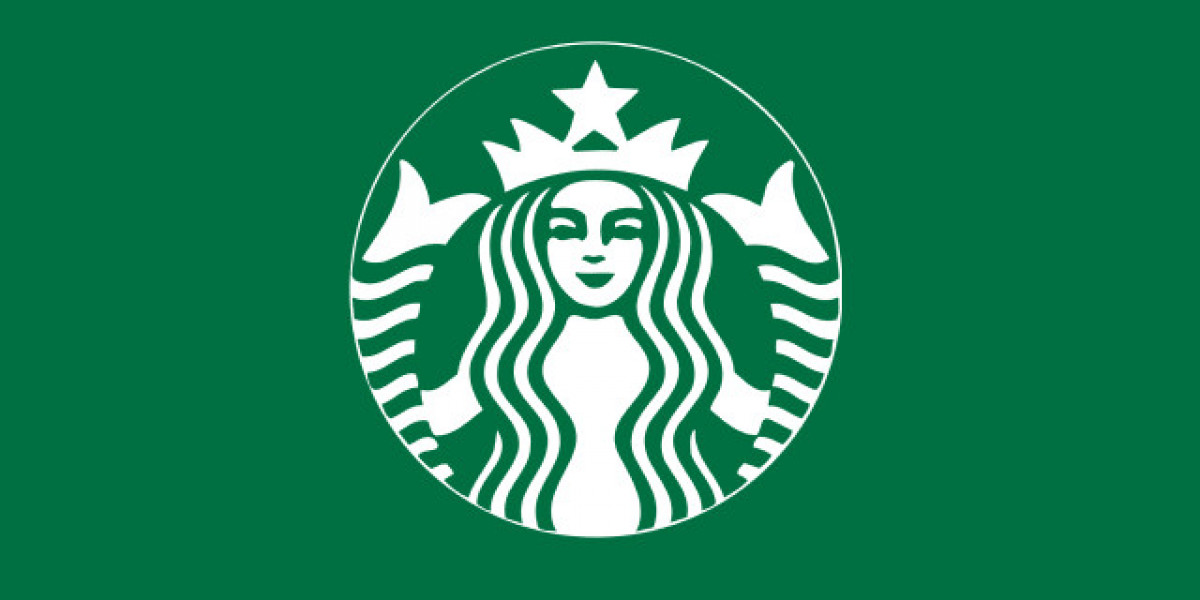
The most recent major change in the Starbucks logo history occurred in 2011, in celebration of the company's 40th anniversary. This redesign was bold and minimalist, reflecting Starbucks’ status as a globally recognized brand. The new logo eliminated the text “Starbucks Coffee” altogether, leaving only the iconic siren in green.
This change signaled the company’s confidence in its brand identity. The siren had become so recognizable that the company no longer needed to include its name in the logo. This minimalist approach allowed the logo to be more versatile, suitable for both physical and digital spaces.
The 2011 redesign also represented Starbucks' expansion beyond coffee. By removing the word “coffee” from the logo, Starbucks could broaden its product offerings to include tea, snacks, and even lifestyle products without being constrained by its original identity as a coffee company.
Conclusion
The Starbucks logo history is a testament to the brand’s ability to evolve while maintaining its core identity. From the original brown, earthy design to the sleek, minimalist green siren we see today, each iteration of the logo reflects a new chapter in the company’s journey. Starbucks' ability to adapt its logo to changing times and expanding markets has played a key role in its success as one of the most recognizable brands in the world.